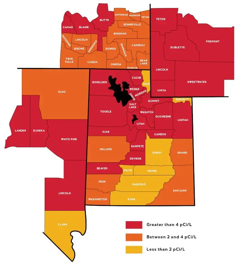
You searched for a map, so let’s start with one. Radon risk in Utah does not spread evenly across the state. It clusters around specific rock formations, fault lines, and soil types. A good map is the fastest way to see that pattern at a glance.
This page walks through the different types of Utah radon maps you’ll come across. It covers what each one actually measures and how to read the colors without making the wrong assumption about your own home. If you want the hard numbers instead, our
Radon Levels in Utah page breaks down exact pCi/L thresholds, county-by-county zone classifications, and what your test result means.
Get a Free Quote
What a Radon Map Actually Shows
A radon map does not measure your house. It measures probability across a large area. Mapmakers build it from thousands of test results, geological surveys, and soil samples collected over the years. Think of it as a weather forecast for radon potential rather than a reading from your own thermostat.
Three things a radon map is good for:
- Spotting general risk patterns across a region
- Understanding why certain counties test higher on average than others
- Deciding how seriously to prioritize testing your own home
Two things a radon map cannot do:
- Tell you the radon level inside your specific house
- Replace an actual test kit or professional monitor
Utah illustrates this gap well. The state as a whole carries some of the highest average indoor radon readings in the country. Yet radon levels can still swing widely between two houses on the same street. A map points you toward risk. Only a test confirms it.
Types of Radon Maps for Utah Homeowners
Several different maps exist, and each one answers a slightly different question. Knowing which map you’re looking at matters more than most people realize.
The EPA National Radon Zone Map
The
EPA Radon Zone Map divides the entire country into three zones based on predicted average indoor radon levels. Zone 1 counties carry the highest predicted potential. Zone 2 falls in the moderate range, and Zone 3 represents the lowest predicted average. Utah counties span both Zone 1 and Zone 2. No Utah county lands are in the lowest-risk category.
The Utah Geological Survey Radon Potential Map
Where the EPA map works at the county level, the
Utah Geological Survey (UGS) publishes a far more detailed geologic radon potential map. Bedrock composition, soil permeability, and uranium concentration data collected across the state build this version. It shows risk down to specific rock formations rather than entire counties. That precision is why two neighborhoods in the same county can show noticeably different colors on this map.
The Wasatch Front region, running through Salt Lake, Davis, and Utah counties, shows some of the most consistent high-potential shading on the UGS map. These lines up directly with the uranium-bearing rock formations that run beneath the valley floor.
An Interactive County Risk Map
A static image only tells part of the story. An interactive county map lets you click into your specific area and see the classification behind it, rather than squinting at a color gradient from a distance. Utah homeowners can build or reference an interactive version through tools like Google My Maps. This approach layers county boundaries with EPA zone data and local test averages in one view.
For a properly labeled, interactive Utah county radon map with the full zone breakdown and numeric thresholds included, our
Radon Levels in Utah page contains the complete table with all 29 counties sorted by risk zone.
A Radon Testing Heat Map
The maps above rely on predicted potential. A testing heat map works differently. It plots actual test results, gathered from homes that have already been tested, and shows where confirmed high readings cluster geographically. This is the most grounded version of a radon map, since it reflects real measurements instead of geological estimates alone.
Radon Be Gone has tested and mitigated thousands of Utah homes since 2008. That test history creates a detailed, ground-truth picture of where elevated radon actually shows up in practice. The pattern holds block by block, not just county by county. If you want to know how your specific neighborhood compares based on real test data rather than a predicted zone, our team can walk you through what we’ve seen in your area.
How Utah's Landscape Shapes the Map
Radon maps look the way they do because of what sits beneath the ground, not because of anything happening above it.
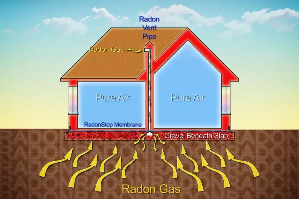
Utah sits atop mountain ranges formed through volcanic activity and tectonic uplift. Both processes concentrate uranium and radium in the bedrock. As those elements decay, they release radon gas that migrates upward through cracks, fault lines, and porous rock layers until it reaches the surface. Along the Wasatch Front, decades of geological surveying have mapped this uranium-rich bedrock in detail. That work explains why this stretch of the state consistently appears in the highest-risk color band.
Valley floors present their own pattern. Loose, permeable soil in valley basins allows radon gas to travel upward more freely than it does through dense rock. This is part of why homes built on valley fill often test differently than homes built directly on bedrock a few miles away, even within the same county.
How to Read the Colors on a Radon Map
Most radon maps use a simple traffic-light system, though the exact colors and thresholds shift slightly between sources.
- Green or low zones generally indicate predicted average readings below 2 pCi/L.
- Yellow or moderate zones typically fall between 2 and 4 pCi/L.
- Red or high zones represent predicted averages above 4 pCi/L, the EPA’s action threshold.
A red zone on the map does not mean every home in that area is dangerous. A green zone does not mean every home is safe. These colors describe an average across hundreds or thousands of properties. Individual homes still vary based on foundation type, construction era, and the exact soil composition beneath that specific lot.
Using the Map Before You Buy, Sell, or Renovate
A radon map earns a place in a few specific real-world decisions, beyond simple curiosity.
House hunting. If you’re comparing neighborhoods across Salt Lake, Utah, or Davis County, checking the zone classification for each area can shape which homes you prioritize for early testing during a purchase.
Listing a home for sale. Sellers in high-potential zones increasingly find that buyers or their agents ask for radon test documentation before closing. Knowing your zone ahead of time helps you decide if testing proactively makes sense.
Planning a renovation. Any project that disturbs the foundation, adds a basement living space, or changes ventilation can shift how radon moves through a home. Checking your zone before the project starts helps you decide if mitigation should be built in from the beginning rather than added later.
In every case, the map sets expectations. The test still delivers the answer.
Why the Map Isn't the Final Answer
A radon map earns its place as a starting point, not a stopping point. Once you know your general risk zone, the next step is a real test inside your actual home.
This is where a map and a test result serve two different purposes. The map tells you how seriously to take the question. The test tells you the answer. For a full breakdown of what your test result means once you have it, including EPA and WHO action thresholds and what Radon Be Gone guarantees on every mitigation system, visit our complete
Radon Levels in Utah guide.
You can
order a test kit here or schedule a professional continuous monitor through our team.
Frequently Asked Questions
Where can I find an official Utah radon map?
The EPA publishes a national zone map that includes Utah’s county classifications. The Utah Geological Survey publishes a more detailed geologic radon potential map specific to the state’s bedrock composition.
Does the map show my exact home's radon level?
No. Every radon map shows predicted or historical averages across an area. Your home’s actual level depends on its specific foundation, construction, and soil contact points. Only a direct test can reveal that number.
Why do neighboring counties show different colors on the map?
Radon potential follows geology, not political boundaries. Two neighboring counties can sit on entirely different rock formations. That difference alone can produce different predicted radon levels even though the counties border each other.
Is a green zone on the map guaranteed to be radon-free?
No zone guarantees a radon-free home. Green zones reflect a lower predicted average, but individual homes within any zone can still test above the action level. Local soil conditions and construction details drive that variation.
How often are Utah radon maps updated?
The EPA zone map is based on data collected over time and updates infrequently. The Utah Geological Survey updates its geologic data as new surveys and test results become available. Testing heat maps built from real mitigation company data, like the patterns Radon Be Gone tracks across its service area, reflects the most current on-the-ground picture.
Can I build my own radon risk map for my neighborhood?
Yes, to a point. Homeowners and neighborhood groups can compile publicly available test results and plot them using a free tool like Google My Maps. This works well for a rough local picture, though it will never carry the precision of a certified test performed at your own address.
See Where Your Home Stands
A map can point you toward risk. Only a test can confirm it. If your area shows up in a high-potential zone on any of the maps above, or if you have simply never tested your home, Radon Be Gone can help you get a clear answer.
Our certified team has tested and mitigated thousands of homes across Salt Lake City and the surrounding areas in Utah. Every system we install carries a lifetime transferable warranty. For the full picture on what your test result means once you have it, visit our
Radon Levels in Utah page next.
Get a Free Quote
Order a Test Kit
![Blue periodic table tile for radon, element 86, with symbol Rn and mass [222].](https://le-cdn.hibuwebsites.com/09c3a4288d5947b58ca8220076f73b94/dms3rep/multi/opt/radon-periodic-table-rn-86-radon-be-gone-1920w.webp)